
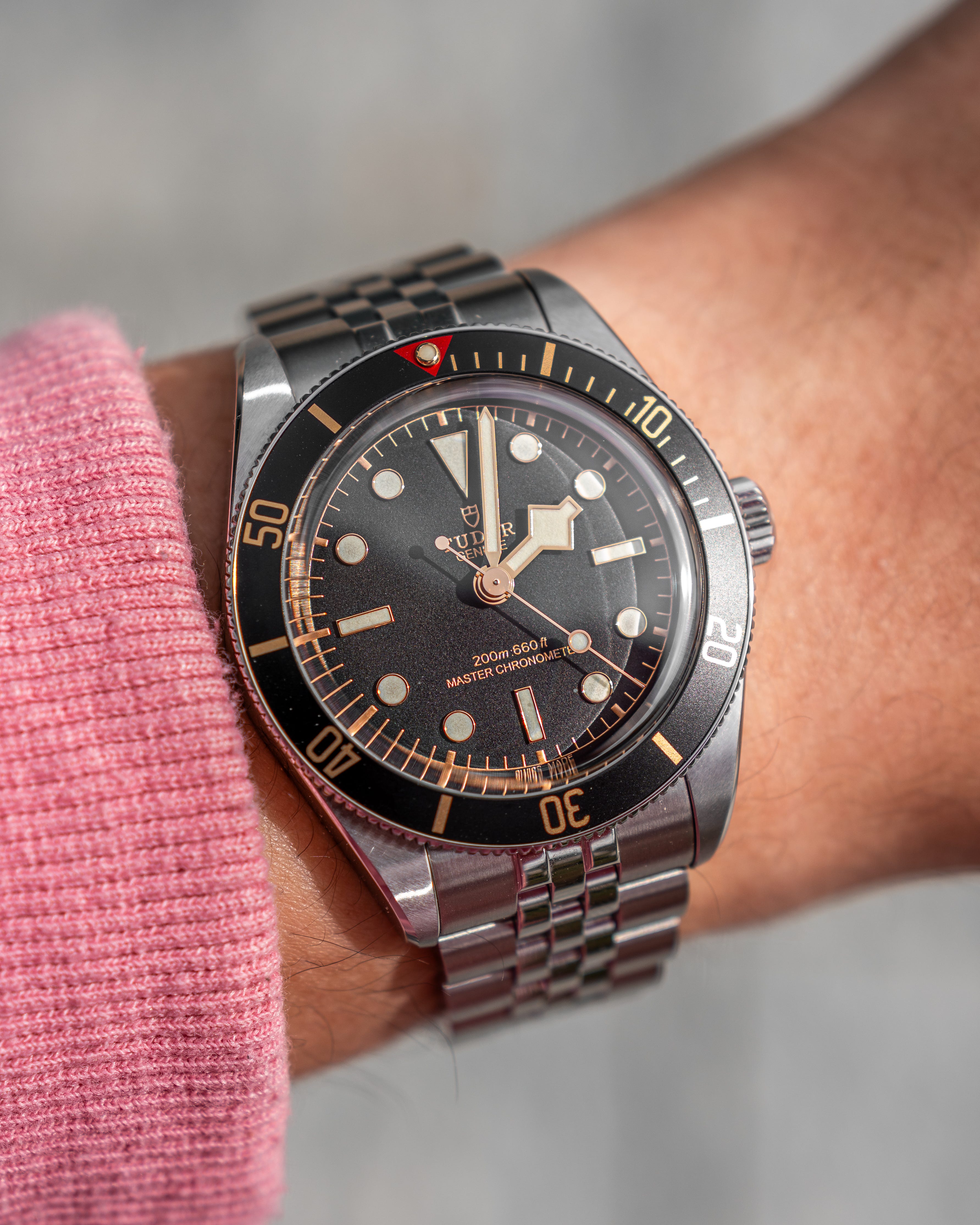
The Tudor Black Bay 58 doesn’t need to work quite so hard to look vintage. Its slim case, chamfered lugs and aluminium bezel already explain the attraction to anyone who has spent too long looking at old Submariners. The snowflake hour hand makes it Tudor. I’m sold. But then come the gold-coloured details, repeated across the dial and bezel, and on the original bracelet, those decorative rivets. At a certain point, I start wishing the design would trust its proportions.
What I want from a vintage-inspired diver begins with its shape. The relationship between the case, dial and bezel determines whether the watch feels convincing long before I start identifying its historical references. The 58 got those fundamentals right when it arrived in 2018. Its waiting lists made sense: here was much of what enthusiasts liked about an older Submariner, in a modern watch. The nostalgia worked because the underlying design was good.
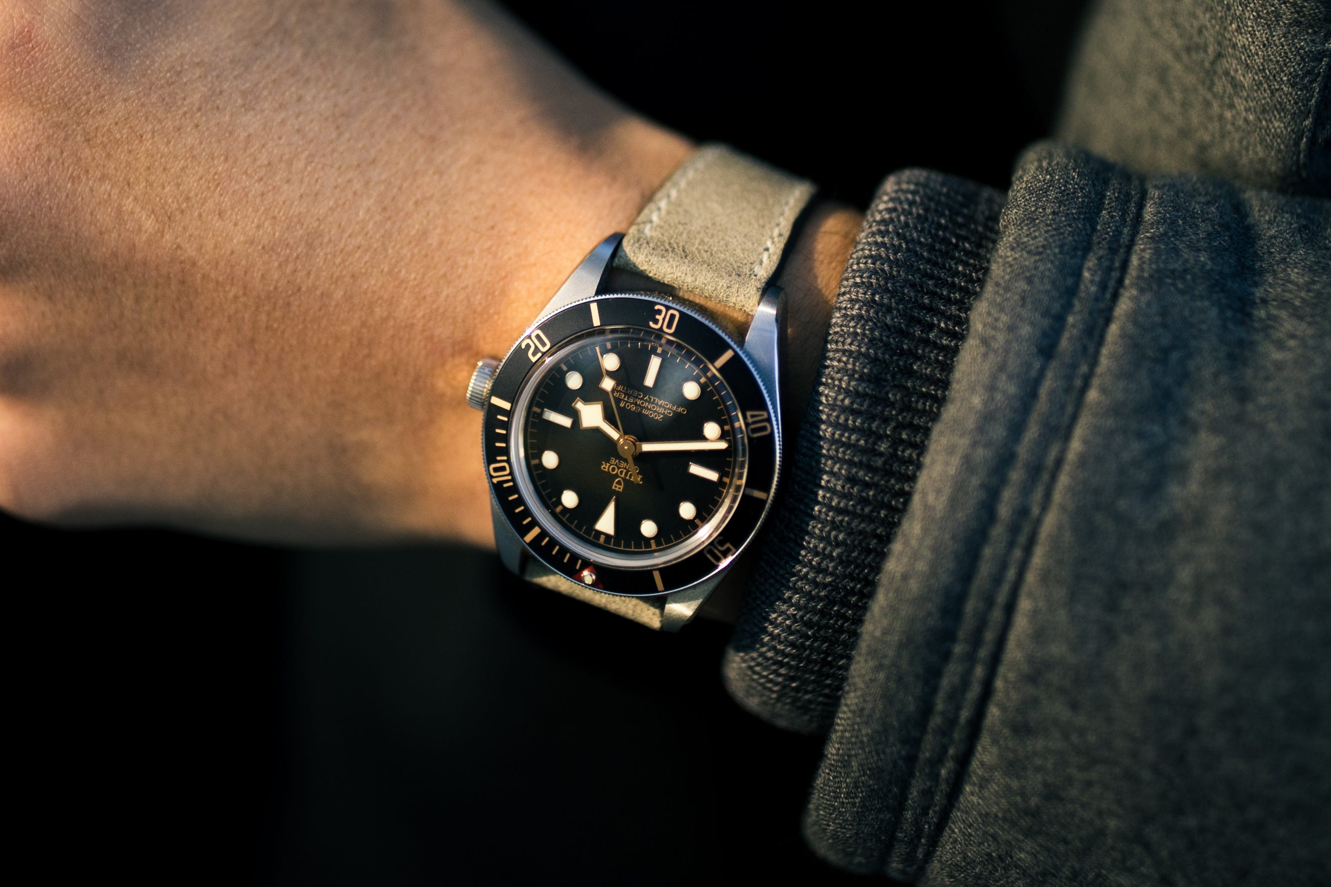
The faux rivets on the original bracelet did little for that design in my eyes. I understood the historical reference, but understanding it didn’t make the bracelet more attractive. They gave an otherwise convincing watch a slightly toy-like quality. The difficulty was knowing what they contributed beyond another reminder of its inspiration. I already liked the 58’s vintage character; I didn’t need every component to explain it again.
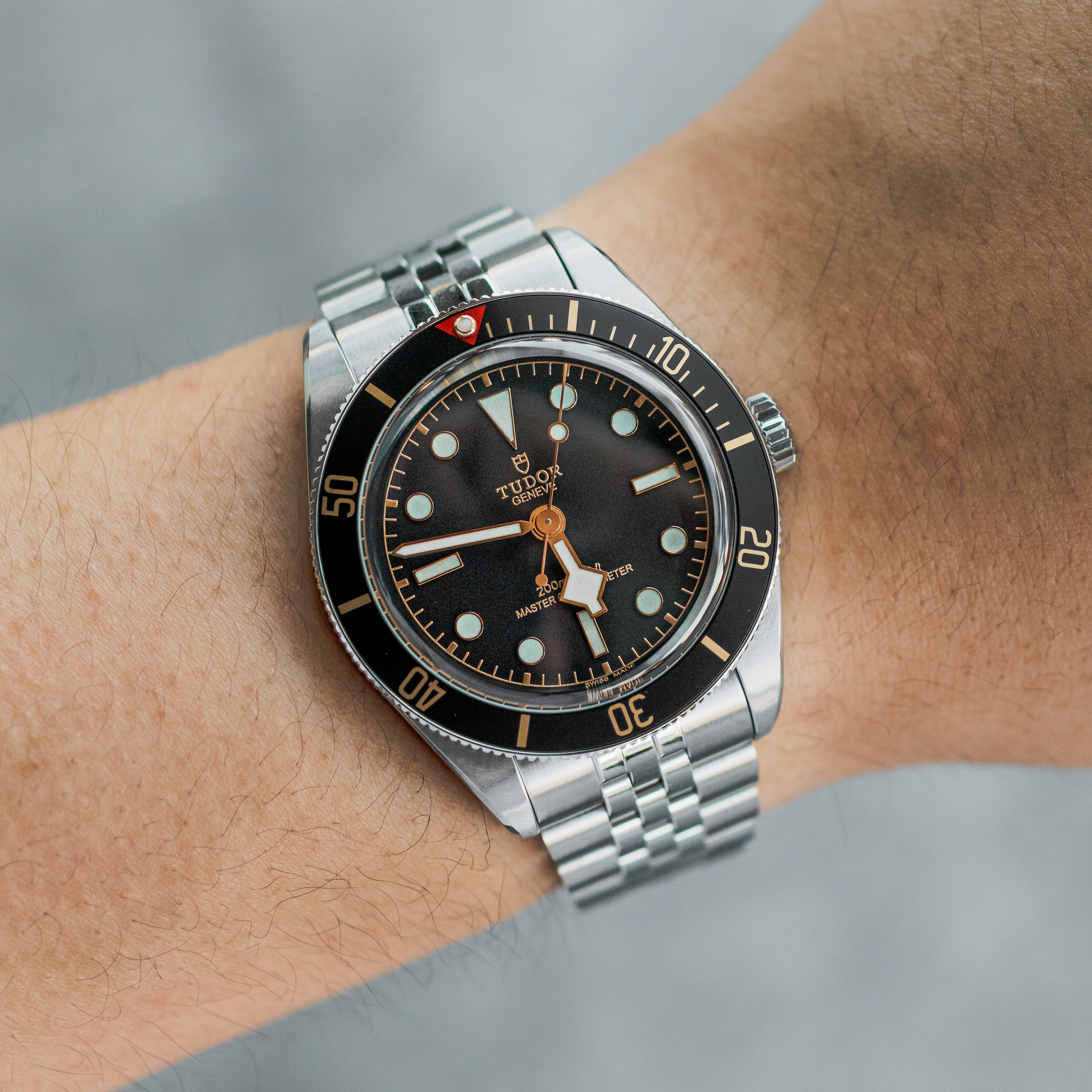
This year’s update gave me a reason to return. Tudor retained the 39mm diameter, slimmed the case to 11.7mm and offered a five-link bracelet with T-fit adjustment. I bought one because that bracelet resolved my main objection. More interestingly, it demonstrated how little the 58 depended on the rivets. The five-link option still has a traditional appearance, and the watch remains immediately recognisable. Tudor had changed an explicit reference to the past without sacrificing the character that made the watch appealing.
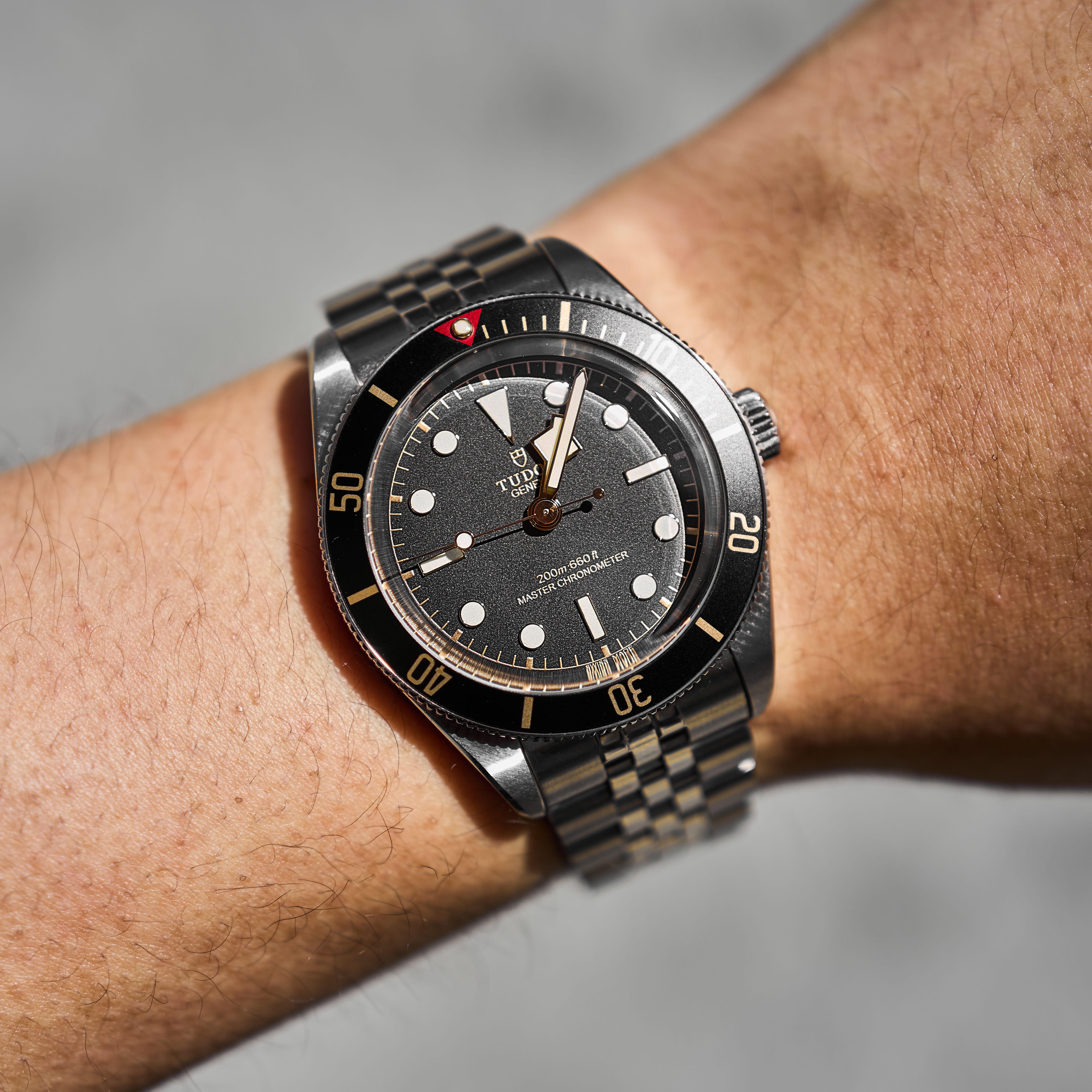
The gilt required a different judgement. Unlike the rivets, it contributed something I actively enjoyed: the warmth of gold-coloured details against a black dial. When my friend Gavin, known on Instagram as @misalignedbez3l, suggested that the dial and bezel carried too much of it, I was initially unconvinced. Gradually, I began to distinguish between liking the gilt itself and liking how extensively Tudor had used it.
I wouldn’t describe this as a problem with faux patina. The gilt has never struck me as an attempt to make the watch look artificially aged. Gold against black is attractive in its own right. My objection was to repeating that combination across both the dial and its surroundings. The bezel reinforced an effect that was already strong enough, giving me something of the same toy-like impression as the original bracelet. The resemblance between those two objections was in the excess, even though the details served different purposes.
Replacing the bezel insert offered a way to test that judgement. I’m not normally drawn to watch modifications, but Steel Reef’s green Arbour insert, with silver-coloured numerals, let me change the surrounding colour scheme while keeping the dial intact. The result made me more appreciative of the original dial. Its gold-coloured details now supplied the warmth I liked without that treatment dominating the whole watch. Changing the bezel had resolved an objection that initially seemed to concern the dial as well.
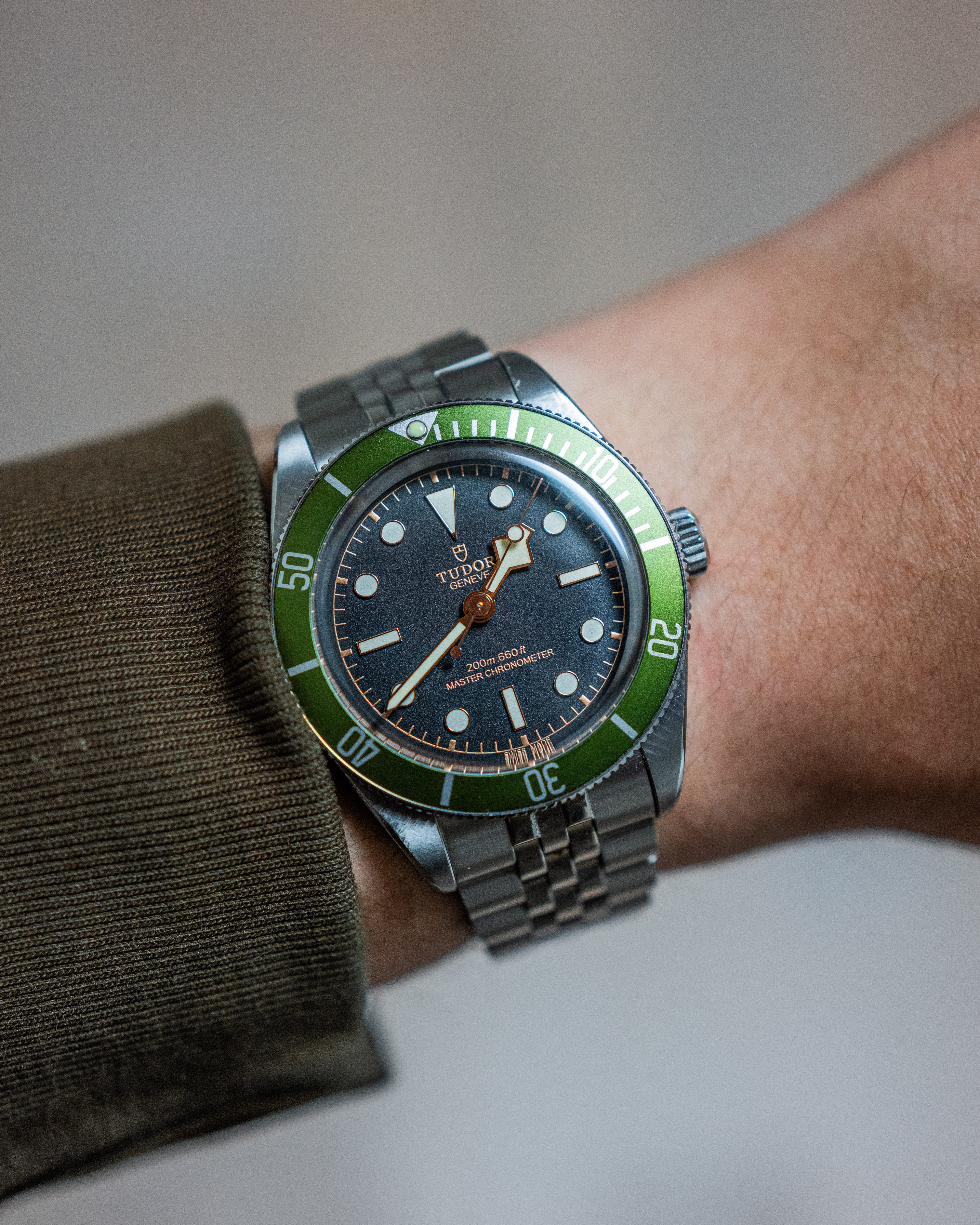
Green is hardly a quieter colour than black. For me, the improvement comes from how the colours relate to each other. The gold-coloured details became an accent within the dial, the silver numerals related to the surrounding steel, and the green gave the bezel its own presence. Each part could be distinct while still belonging to the same watch.
There is a reasonable defence of Tudor’s original choice. Matching the gilt on the dial and bezel creates continuity, and someone who enjoys that warmth may find my version less coherent. I understand the attraction. On my wrist, though, the continuity had become insistence: the same decorative treatment occupied too much of what I was looking at. The new combination gives the gilt a more contained role. That feels more balanced to me, even though it is also more colourful.
This is where the modification has changed how I think about the 58. Its vintage appeal survives perfectly well with fewer gilt details, just as its identity survived the switch to a five-link bracelet. Those observations suggest that the case proportions and the distinctive dial carry more of its character than the accumulation of period references does. A modern watch can borrow generously from the past while remaining selective about which details belong together. Historical familiarity alone doesn’t settle that decision.
My preference for green plainly influences the result. I’ve started calling this watch my “Baby Kermit”, recalling the green insert I fitted to my first Rolex Submariner, a 16610LN, as I described in Before Reference Numbers. That change was an attempt to get closer to the 16610LV, and it never satisfied my desire for a different reference. With the Tudor, the snowflake hand, gilt dial and five-link bracelet are already what I want. The resemblance to a Kermit is enjoyable, but the success of this change lies in making me happier with the Tudor.
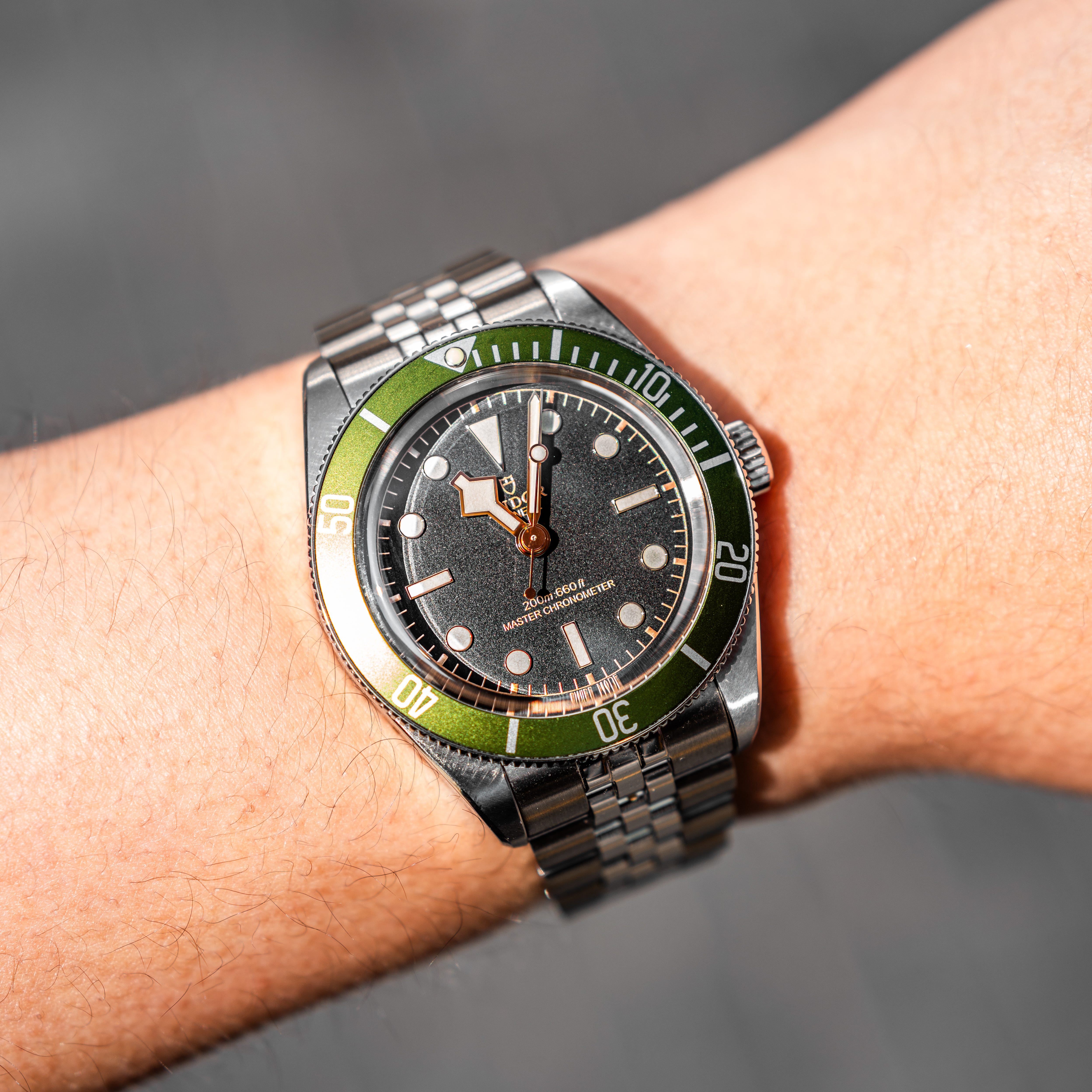
Fitting the insert myself adds another kind of satisfaction. I left a small scratch on the side of one lug, and I don’t mind it. The mark records my part in making the watch look this way. It gives this particular 58 a little history of its own and makes it feel truly mine.
I may still be enjoying the honeymoon, but the modification has clarified what I want from a modern watch with vintage roots. Historical details should earn their place through what they contribute to the whole design. The 58’s proportions and recognisable Tudor character were strong enough to survive changing a few of those details. On my wrist, the result feels more complete. I have a feeling this one is a keeper.